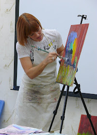
Warm Color Experiment in Progress
I have this t-shirt with peacock feather pattern on it, and it's black, purple and yellow. One day that shirt got me thinking about making a collage of a peacock with warm colors rather than the traditional cool blues, teals, greens and yellow greens. It was a challenge to take the peacock and swap out the colors, but it was also a reminder to me of one of my own lessons: It's not the color that makes the subject read as real, it's having the right values.
I tell my workshop students that if they can't always find the right color in their painted collage papers, that's OK. What you need to be sure you have is the right value. Light, dark, medium, darkest dark, lightest light.... that's what makes objects read as real and dimensional.
So, this "warm peacock" is not in its local color (the true color of an object or surface as seen in typical daylight), but the proper values are what makes it work and read as real.
Here I am about half way done, with the tail feathers and the background. the head and neck are still in an underpainting state. I plan to leave the nice drips in the lower left. Did you know that a peacock from behind is totally black and white? That can be seen in the lower right with an area that I created from old library book illustrations...
Stay tuned...


